Mostrando postagens com marcador android. Mostrar todas as postagens

terça-feira, 27 de agosto de 2013

HP SlateBook x2 Review: A Good Tablet Plagued by Too Many Design Flaws

HP hasn't had many shots at making tablets yet. Their previous release, the Slate 7 was rather disappointing, but I must admit I felt excited when they announced their 10-inch Tegra 4-powered, Full HD Android tablet/notebook hybrid. It was especially exciting for me to see that both the tablet and keyboard would sell for a reasonable $479.99 price tag. Unfortunately, though, the SlateBook x2 turned out to be good only in theory, because while the device looks great on paper, it turned out to be plagued by so many design flaws it ruined my expectations for the device, making it not worth the $480 price tag.


I actually quite like the industrial design HP used here. The back of the tablet is made of a nice-looking plastic, and is available in two shades of grey (* wink *), light and dark grey. A rather large Hewlett-Packard logo is etched on the center, and on the top-center of the back is the 1080p-capable rear camera. HP did a rather odd thing here: they opted to place the power button and volume rocker at the left and right edges of the back of the device. This makes the buttons considerably easier to reach when you're holding the tablet in landscape, but it still looks a bit awkward.

On the front, the 10-inch 1920 x 1200 display is surrounded by not too large nor too narrow bezels. I actually think that this is the ideal bezel size for a 10-incher. Above the display is the 720p-capable front-facing camera and the ambient light sensor. Below the display is a small, centered HP logo (why do OEMs usually insist on putting two logos on their devices?), and below it, on either edge of the device is a speaker grille. Overall, I like their design language, at least for the tablet only.

Every once in a while I review a device, and I see design flaws that are so obvious that I realize how little effort some OEMs make to produce a decent product. The SlateBook x2 is once such victim of its OEM's carelessness, because when you dock the tablet into the keyboard, the microSD card slot and the headphone jack become inaccessible, because the dock connector is in the same side of the tablet as these two ports. You can probably get past the microSD slot's positioning quite easily, but c'mon, I'd like to be able to plug in my headphones and have the keyboard docked at the same time. Additionally, the speaker grilles, also located on the bottom end of the tablet, also get hidden when the keyboard is docked. Thankfully, this doesn't affect the sound quality too much, but come on HP, it's common sense. However, the keyboard dock is otherwise well designed. It looks nicely crafted, and the multi-touch pad is slightly wider than what we usually see in 10-inch keyboard docks. Typing on it should feel more or less the same than it would on any other 10-inch hybrid (cramped, but still usable).

HP didn't offer any numbers on weight and thickness of the tablet only and, probably to emphasize that the dock is an essential part of the product, only gave us the numbers referring to the tablet plus the dock. With the dock on, the device weighs an OK 1.29 kilograms and is relatively thin, at 0.81". 

On paper, you'd think the device's display is pretty good. After all, the LED-Backlit 10.1 inch unit has a respectable resolution of 1920 x 1200 (224ppi). But the display's sharpness isn't the problem, it's the color accuracy that's way off. Basically, the SlateBook x2 can't reproduce anything close to white. When rendering web pages with white backgrounds, you'd see a distinct yellow tinge instead of white. And I'm not saying the display's white temperature is a bit warm, I'm saying it's a distinct yellow. The color inaccuracy basically ruins the display for most uses. 

Under the hood, the device is, again on paper, a very capable one. That's because the SlateBook x2 houses NVIDIA's state-of-the-art Tegra 4 SoC, accompanied by 2 GB of DDR3L-1600 RAM. If you don't know/remember, the Tegra 4 is a 28nm SoC consisting of a quad-core ARM Cortex-A15 CPU clocked at 1.9GHz (this tablet is limited to 1.8GHz though), plus a power saver Cortex-A15 companion core which is limited to 825 MHz and is designed to handle light tasks, increasing battery life. The powerful CPU is accompanied by an equaly powerful 72-core GeForce GPU and dual-channel DDR3L @ 1899 MHz. With such powerful specs, you'd expect the SlateBok x2 to be blazing fast, but if Android Jelly Bean and Project Butter taught me something, is that software is as important as the hardware for a device's speed, and the SlateBook x2 further proves that, because despite having a very capable processor, the tablet still feels slow at times. For example, apps take longer than usual to open. If it's not a software issue, I'd say that the problem is slow storage transfer rate (they were rather mediocre in benchmarks). Gaming performance is not as bad in the SlateBook x2, as it can produce very similar benchmark results to other Tegra 4 devices (the NVIDIA Shield is still ahead, though, probably because it has a cooling fan), hence gaming performance shouldn't be a problem, especially at 1080p (Tegra 4 can handle 2560 x 1600 resolutions well, so it can handle 1080p even better). 

The SlateBook x2 runs on stock Android 4.2.2 (the only customization is a couple of HP ultilities installed). The $480 price will get you the tablet, the keyboard, and 16 GB of storage (expandable through the microSD card slot). I think its nice that the $480 price tag is for the keyboard included. But still, the truth is that HP's tablet has potential; it has a crisp screen, a nice looking industrial design, just about the fastest SoC available and that useful keyboard dock, but it has so many design flaws that ruin the user experience of the device. The saddest part is that these flaws are very obvious and pretty easy to remedy, which shows that HP didn't care much about making the device good. Due to its flaws I strongly recommend other tablets at the same price point, even if they don't have a keyboard dock included, for example the Sony Xperia Tablet Z, the iPad 4 or the even cheaper Google Nexus 10. 

segunda-feira, 12 de agosto de 2013

Sony Xperia Z Ultra Review: Ultra Large, Ultra Fast


No one can deny it. Sony has made huge strides in the smartphone department, going from being a minor smartphone vendor to one of the market's biggest players. Having successfully taken on the smartphone competition with the rugged Xperia Z, and also produced quite a good tablet with the Xperia Tablet Z, Sony is now extending the Z-series' reach to include phablets. Enter Xperia Z Ultra. The new flagship device touts an already proven design with a beautiful, enormous screen and industry leading performance.


The design is where Sony has become extremely successful this year, and it shows in the Xperia Z Ultra. To put it simply, the Ultra is SLIM. Measuring 6.5 mm, the phablet is thinner than just about every major smartphone available. It's quite heavy, weighing 212g, but when you think about its size you realize it's pretty light. Despite being so thin, and despite having such a classy design, Sony managed to make this device as rugged as it can get. The Ultra has IP58 certification, which basically means it's dust proof, and also waterproof, for up to 30 minutes under one meter of water (given that all the ports are covered), so, despite how fragile this device looks, it can take a lot of damage.

The back of the device, much like the Xperia Z and the Tablet Z, is beautiful. Very simplistic and very stylish, the back is covered by a layer of glass, which gives the device a slightly reflective effect. The phablet is available in black, white, and purple (?). The bottom of the back contains an Xperia logo, and on the center there's a Sony logo. On the top, there's a very good 8 MP camera, capable of 1080p video and HDR, but without an LED flash. The general cleanness of the back, together with the glass-induced reflectiveness, results in a very premium, expensive look for the Ultra. 

The front of the device is almost 100% display, which has become common in large screen devices. The left and right bezels are very slim, but unfortunately the top and bottom bezels could be slimmer. Granted, though, the top bezel needs space for the Sony logo, the proximity and ambient light sensor and the front-facing 2 MP camera, also capable of shooting 1080p video (a bit pointless really, in my opinion), and the bottom bezel is probably as large as the top one to induce symmetry in the design.

Honestly, I think that the Xperia Z Ultra is too close to tablet territory in terms of screen size. Measuring 6.4 inches diagonally, it begs for more comparison to the Nexus 7 than, say, the Galaxy S4 or Note II. Many people will probably like it, but personally, I think the display size isn't ideal for neither tablet-like nor smartphone-like use. 6.4 inches means it's probably too big to fit into your pocket (and the added weight also makes that more difficult) and it could be awkward to stick that to your face and talk on the phone, so I find it inadequate for use as a smartphone. So the only reason why you'd want that device, other advantages aside, is either if you think the Nexus 7 is too large (you probably don't, except perhaps if you have tiny hands) or if you want something almost Nexus 7-sized that can make calls (a question from the Galaxy Tab 7.0 time, when it was often discussed how weird it is to talk on the phone with such a big device). You might have other reasons, and if you feel the screen size is good, you can't possibly be disappointed by the Xperia Z Ultra.

Odd screen size aside, the display is gorgeous. Sony is introducing the new Triluminos display technology with X-Reality enhancement, which is the successor to the already proven Mobile BRAVIA Engine. Basically, X-Reality will boost the color saturation of images, video, games, etc. significantly, making everything pop out more. The 1920 x 1080 resolution results in a pixel density of 344ppi (lower than 5" 1080p smartphones' 441ppi, but unless you're using a microscope you won't notice the difference), ensuring razor-sharp text and clear images. Combine the enhanced colors of the display, thanks to X-Reality, with the very crisp pixel density, and you have a near-perfect display in your hands. 

Under the hood is where the Xperia Z Ultra impresses the most. That would be because the Ultra is one of the first products to launch with the brand new Snapdragon 800 SoC paired with 2 GB of RAM. For a recap, the Snapdragon 800 is a 28nm SoC consisting of four Krait 400 cores ticking at a monster 2.3GHz, plus a brand new Adreno 330 GPU, which, as benchmarks show, is by far better than any of the competition, even NVIDIA's recently launched Tegra 4. The Xperia Z Ultra can therefore handle, and I say literally, anything. UI performance will definitely be flawless, and it'll be a monstrous mobile gaming machine (it's faster than the NVIDIA Shield. Period). The Ultra's SoC will only disappoint you when OpenGL ES 4.0 becomes the norm in games, and would happen around 2018-2020. To put it simply, whether you want a device to do some simple web browsing, reading and watching videos, or if you're a hardcore mobile gamer, the Xperia Z Ultra won't disappoint you.

Other specs include Android 4.2 out of the box and a non-removable, beefy 3050 mAh battery, but ironically, Sony claims 16 hours of talk time and up to 7 hours of video playback, which is good, but not as good as the battery size might suggest. Well, I suppose that's the price for such a large display.

The device was already released, although it hasn't arrived in the US yet, but you can find it in a retailer or two for $799. This is, I think, the same price as the Galaxy S4 without a contract, so it's not unaffordable, and it works perfectly as a phone, touting 4G LTE connectivity. If you're not bothered by the screen size, you're basically getting a near-perfect device. It offers a beautiful, yet very durable design and spotless performance, and I definitely recommend the device if the screen size is OK for you.

Toshiba Excite Pro Review: A great hi-res tablet plagued by an unattractive design


Toshiba isn't a very big player in the tablet space, but, well, maybe it's trying to become one. They announced, earlier this year, three Android 10-inch tablets, each competing at different price points, the Excite Pure, Excite Pro and Excite Write, which sell for $299, $499 and $599, respectively. Whatever qualities these devices have, it still remains that Toshiba's industrial design is far from attractive, which, in the tablet market, is likely to single-handedly make this device be a failure.

The Excite Pro is the middle child in the Excite family. It offers some top-notch specs at an accordingly high price of $499 for the 32 GB version, which puts it in the same price range as the Nexus 10 with the same storage capacity, and is the same price as the entry-level 16 GB iPad 4.


Its main downfall is its design, like I said before. Statistically speaking, it's not a svelte tablet. It's 10.2 mm thick (thicker than the 9.4 mm iPad 4) and weighs a reasonable 635g (lighter than the 650g iPad 4, but still considerably heavier than many Android tablets out there).

The back is composed of two stereo speakers positioned on either side of the device, horizontally. These speakers are produced by harman-kardon, and can therefore reproduce some excellent sound. Then there's a Toshiba logo on the bottom left, and the top right houses a pretty good 8 MP camera with F/2.2 aperture lens, alongside an LED flash. The back is made of an industrial, rather unattractive gray plastic. The front houses some rather large bezels, and, above the very good 10.1" 2560 x 1600 display is the ambient light sensor and the front-facing 1.2 MP camera, and below the display is, on the left of the bezel, a Toshiba logo, and to the right, a harman/kardon logo. I find the two logos are too much of a visual interruption, and ruin the looks of the front of the device too. One logo is easy to overlook, but any more than that, and the front doesn't look nearly as clean as it should be. 

The display of the Excite Pro is at the top-notch configuration of the tablet market, as it features a large, 10.1" screen size and a whopping resolution of 2560 x 1600 pixels, which gives the display a very crisp 299ppi pixel density, which is on par with the Nexus 10, and higher than the iPad 4's 264ppi. The high resolution, combined with the display's IPS technology, ensures wide viewing angles, colorful, clear images and razor-sharp text. 

Of course, one does not simply pull off such a high resolution display without a lot of processing power under the hood. Never fear, though. The Excite Pro is perfectly equipped to handle even complex 3D games at its native resolution, thanks to its blazing NVIDIA Tegra 4 SoC. For those who don't know, the Tegra 4 has a Quad-core ARM Cortex-A15 processor running at up to 1.9GHz, with a low-power A15 companion core for handling light tasks and increasing battery life. The CPU is coupled with an equally fast 72-core GeForce GPU and 2 GB of DDR3L RAM.

WIth such a high-resolution display and what appears to be a potentially power hungry SoC, one would be concerned about the device's battery life. Well, as it is, the thick profile of the device gives it the one big advantage of being able to carry a larger battery, and while the 33 Wh "Prismatic" battery included isn't the biggest ever seen of a tablet (the iPad 4 has a 42.5 Wh battery and is still considerably thinner), Toshiba claims it can get you through 9.5 hours of video playback, which is quite good, considering how many pixels are being pushed there. 

The Excite Pro, from a spec point of view, is one of the absolute best tablets out there. It marries a pretty beefy battery with an excellent display, industry leading performance, but unfortunately the looks of the tablet simply spoil whatever other advantages it has. In the tablet market, it's definitely better to have a better looking, more svelte tablet but with slightly weaker internals. And at $499 for 32 GB, there shouldn't really be a compromise on either aspect. While some people might not care about the bad looks of the device, there are still other alternatives which for the same price, offer almost identical performance and have designs which aren't painful to look at.

sexta-feira, 8 de março de 2013

Samsung Galaxy Note 8.0 preview


Samsung has been giving Apple a hard time with its increasingly popular mobile devices. For some time last year, Samsung's flagship smartphone, the Galaxy S III, beat the iPhone in terms of sales, and now Samsung is showing interest in competing with Apple's iPad series in the tablet market. Having already a competitor in the 10-inch tablet market (Galaxy Note 10.1), Samsung now prepares a tablet destined for competing with smaller tablets. The Galaxy Note 8.0 isn't supposed to compete in the budget-centered 7" market, which includes the Nexus 7 and Kindle Fire, but is more destined to compete with the not so budget-centered 8"-ish Apple iPad mini. The Galaxy Note 8.0 was officially announced at MWC, and looks like a promising competitor. Check out the full specification sheet for both the Wi-Fi only and 4G LTE versions of the Note 8.0

The Galaxy Note 8.0 follows closely a kind of design that emerged with the Galaxy S III, and was present in most subsequent Samsung phones as well as the Note II phablet. The corners are very curved, and the back is made of plastic, with the 5MP camera, which can shoot up to 1080p video, situated at the top center of the device. Like every other small tablet out there, the Galaxy Note 8.0 is clearly oriented for portrait mode usage. On the bottom there is the usual centered home button, and on either side of the button there are two capacitive buttons. On the top we have a Samsung logo, and above it are the 1.3MP front camera and some sensors. The Galaxy Note 8.0, much like every other member of the Note family, comes with a nifty S-Pen, a stylus which is an excellent alternative to touch input. The display of the Galaxy Note 8.0 isn't exactly breakthrough, but on a lower-price market like the 7-8" tablet market, the display isn't shabby at all. The 8" TFT display has a 1280 x 800 resolution, the same resolution found on the Nexus 7. The pixel density, therefore, is a nice 189ppi, which is between the 216ppi display of the Nexus 7 and the 163ppi of the iPad mini. Not shabby at all, like I said. 

In terms of performance, the Note 8.0 isn't a benchmark champion, nor does it boast particularly new technology, but still, it is much better than both the iPad mini, with its aged Apple A5 (32nm version) SoC, and the Nexus 7, which has an NVIDIA Tegra 3 processor, (and pretty much every other small tablet). The Note 8.0, in fact, comes with Samsung's very own Exynos 4412 processor, which boasts four ARM Cortex-A9 cores clocked at a high 1.6GHz, as well as a higher clocked Mali-400MP GPU. This is actually the very same chip found inside the Note II, therefore, the Note 8.0 should provide nearly identical performance to the Note II (especially because they both have the same resolution). The Note 10.1, which has a similar SoC, only with a 1.4GHz CPU, should also almost equal the Note 8.0 in terms of performance. 

The Galaxy Note 8.0 comes with a 4600mAh battery, and comes in 16 and 32 GB versions, as well as Wi-Fi and LTE versions. The expected release date for the Galaxy Note 8.0 is somewhere around Q2 2013, and once it does, I personally take a good chunk out of iPad mini sales, but I think the Nexus 7 will still be the top seller of the small tablet market, due to its very good quality relative to its very low p

domingo, 18 de novembro de 2012

Tablet Wars: Apple iPad, Microsoft Surface, Or Google Nexus 10?

The tablet market used to be very narrow only two years ago (a bit less). There was the iPad, the Motorola XOOM, the Samsung Galaxy Tab, and a few others. Now, of course, the tablet market has broadened a lot, and is starting to become just like the PC market. Most recently, Microsoft decided to jump into the tablet realm with its Surface tablet and its new ARM-compliant Windows RT, and Google decided to start making tablets too, as a part of the Nexus series, which used to include smartphones only. So now we have one representative for each of the tablet OSes, Apple's iPad 4 for iOS, Google's Nexus 10 for Android, and Microsoft's Surface for Windows RT. One question that is also necessary to determine which slate is the 'best' one is which OS is the best? Therefore, this comparison won't only compare the tablets, but will also compare the OS they run on. Let's begin with a basic specs comparison:
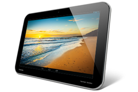
Apple iPad 4 Google Nexus 10 Microsoft Surface
Network Connectivity Wi-Fi + 3G/4G LTE Wi-Fi Wi-Fi
Body 241.2 x 185.7 x 9.4 mm, 652g 263.8 x 177.8 x 8.9 mm, 603g 274.6 x 172 x 9.4 mm, 680g
Display 9.7" IPS LED-backlit 2048 x 1536 Retina display (264ppi) 10.1" Super PLS TFT 2560 x 1600 (299ppi) w/Corning Gorilla Glass 10.6" TFT 1366 x 768 (148ppi)
Storage 16/32/64 GB, 1GB RAM 16/32 GB, 2GB RAM 32/64 GB, 2GB RAM
Camera (rear) 5MP (1080p video) w/LED flash, autofocus, face detection 5MP (1080p video) w/autofocus, face detection, video stabilization 1.2MP (720p video)
Camera (front) 1.2MP (720p video) w/face detection 1.9MP 1.2MP (720p video)
OS iOS 6 Android 4.2 Jelly Bean Windows RT
Chipset/CPU Apple A6X (Dual-core Swift @ 1.4GHz + quad-channel LPDDR2-1066 memory) Samsung Exynos 5250 (Dual Cortex-A15 @ 1.7GHz + dual-channel DDR3-1600 memory) NVIDIA Tegra 3 T30 (Quad Cortex-A9 @ 1.3GHz + single-channel LPDDR2-1066 memory)
GPU PowerVR SGX554MP4 Mali-T604 NVIDIA 12-core GeForce

Design


These three tablets have unique designs, and are all a pleasure to look at, each with its pros and cons. Statistically speaking, however, I believe that the best design title goes to the Nexus 10, since it is the thinnest one, as well as the lightest (see specs). The iPad may not be as light, or as thin, but it still feels and looks good. The same can't be said about the Microsoft Surface, however. The Surface is as thick as the iPad 4, however, it is, simply put, a brick. At 680g, it is as heavy (or even heavier) than some of the first-gen tablets (the ASUS Eee Pad Transformer, for instance, weighed 680g too, and so did the first-gen iPad). The Surface's weight is simply unnacceptable for this time. That aside, the design of these slates can't be classified as better or worse; it is something each user defines. Each of these designs have their unique features, some people will like them, others won't.

Display

The interesting thing here is that we have three slates, all with different aspect ratios. Depending on the use, each of these aspect ratios may be the better one (or not). Let's begin with what I consider to be the worst display of these three tablets.
The Microsoft Surface uses a 1366 x 768 display, which corresponds to a 16:9 aspect ratio. At an unusual screen size of 10.6", this translates into a 148ppi pixel density. The pixel density is on par with last-gen Android and Apple slates, but is about half of what these other two tablets offer, as a result, the screen isn't very crisp, images are not clear, and text is not sharp. The screen's color is not exactly the best, but it's not really bad. Also, the 10.6" screen might be a little too large for some people (me included). The 16:9 aspect ratio is excellent for viewing widescreen movies, however, it makes the display a tad too wide. It makes the tablet look strange.
Next is the Apple iPad 4's display, the legendary and slightly overrated Retina Display. Apple was the first to choose an incredibly large display of 2048 x 1536 resolution, which resulted in a stunning 264ppi pixel density. As a result, text is razor sharp, and images are bright and clear. Apple continues delivering, also, some excellent color reproduction on the iPad 4; colors are bright and vivid, unlike most other tablets. The 4:3 aspect ratio makes the iPad almost square, and the aspect ratio might cause movies to be displayed with those annoying black bars, however, 4:3 is very good for web browsing.
Finally, we have the Nexus 10's impressive display. This tablet breaks the record of tablet screen resolution the iPad set and delivers a stunning 2560 x 1600 display, which, at the 10.1" size, gives an aggressive 299ppi pixel density, making the term 'Retina Display' lose some of its luster. The Nexus 10 has Samsung's PLS display, which has been used in many of the company's Galaxy Tab slates. At any rate, PLS has proved to deliver very vivid colors, boasting some excellent color reproduction. The Nexus 10 was reported to have rather poor contrast ratio, as well as brightness, but it still delivers excellent visuals, but it shouldn't perform very well outdoors in bright, sunny days. The 16:10 aspect ratio is similar to the one in the Microsoft Surface, but it doesn't have the issue of being so wide it looks weird. Simply put, the 16:10 aspect ratio is the balance between being too square and too wide.

Performance

I can't include benchmarks of the Microsoft Surface here, because Windows RT still doesn't have any synthetic benchmarks available, however, I will be including benchmarks of the same SoC (Tegra 3 T30), but on an Android device (The ASUS Transformer Prime). The Surface uses an NVIDIA Tegra 3 SoC (T30 variant), which has a Quad-core Cortex-A9 CPU @ 1.3GHz, and NVIDIA's own 12-core GeForce GPU, with a quite shabby single-channel LPDDR2-1066 memory interface (although other Tegra 3 iterations use better DDR3L memory). Microsoft's choice of using the Tegra 3 was very weird to me, considering that NVIDIA's SoC is an aging, one-year-old chip. The story is different with Apple's and Google's slates, which are both debuting a brand new SoC. The iPad 4 debuts the Apple A6X chip, which has a dual-core Swift CPU @ 1.4GHz. Swift is a custom CPU architecture created by Apple. The A6X also includes a PowerVR SGX554MP4 GPU, together with the same crazily wide memory controller found in the A5X (four LPDDR2-1066 channels), resulting in 12.8GB/s theoretical memory bandwidth.
The Nexus 10 debuts the Samsung Exynos 5250 SoC, which is the first SoC to use ARM's Cortex-A15 CPU architecture. The SoC has a two Cortex-A15 cores ticking at 1.7GHz. The GPU in the Exynos 5250 is the brand new Mali-T604 GPU, which is also the first GPU to use the new midgard architecture, including an unified shader architecture. The memory interface, much like the A5X/6X, can achieve 12.8GB/s theoretical bandwidth, but in a different approach (two DDR3-1600 channels).
Now let's see what synthetic benchmarks tell us about these SoCs.


Geekbench tests mainly the compute power of the CPU. The NVIDIA Tegra 3's age shows here. After all, in its time, it was the absolute champion of CPU benchmarks, although now it isn't very good. For a brand new CPU, the Apple A6X's dual-core Swift doesn't impress, either. It is only a bit more powerful than the one-year-old Tegra 3. On the Nexus 10, we enter another realm, however. We see that the dual Cortex-A15 inside the Exynos 5250 really blasts all other competition out of the water, setting a new benchmark for mobile CPU compute power.


We can see just how poorly the Tegra 3 performs in terms of fill rate. We can say that the SoC's age is partially to blame here, but to be honest fill rate was never the Tegra 3's strong point. We also se a 50%+ gap between the Nexus 10 and the iPad 4. This is very strange, because both SoCs have equal theoretical memory bandwidth figures (12.8GB/s), but in any case, we see Apple is really ahead in terms of fill rate. Fill rate has always been a real forte for iDevices, after all. The Exynos 5250 isn't shabby at all, however, seeing as it is miles ahead of the other Android-based competition.


The Egypt HD test is the test that will relate closest to real gaming experience. Both the offscreen and onscreen test tell pretty much the same thing: that the Tegra 3 is an aged, last-gen GPU that cannot compete with today's competition, and therefore means that the Surface is not exactly good for gaming enthusiasts. We can also see, once again, the significant margin between the PowerVR SGX554MP4 in the A6X and the Mali-T604 in the Exynos 5250, but, then again, it is apparent that the Nexus 10 is far ahead from the Android competition (except in the Onscreen test, where the Nexus 10's immense resolution restrains it).


Once again, the A6X shows unprecedented performance in triangle throughput. In terms of our other two competitors, we get a unusual little surprise here. The Nexus 10 shows some very poor triangle throughput. Well, anyone who has seen ARM's last GPU benchmarked, the Mali-400MP, will know that ARM isn't very good on their geometry processing. The Mali-400 is known for having some of the lowest geometry processing power recently seen on a GPU. While ARM's new midgard architecture did help the new Mali-T6xx GPUs' geometry processing, and there is a very large improvement over its predecessor, it still isn't up to scratch. It scores even lower than the old Tegra 3. Although, it can be said that triangle throughput is something of a forte for NVIDIA, and that reflects on the fact that despite the Tegra 3's age, it can still compete fairly well with newer GPU competition. Still, the good triangle throughput doesn't save the Tegra 3 from being considered a weak GPU.

It is obvious from these tests that the Nexus 10 can take the crown for CPU power, and also packs a punch in terms of gaming performance and fill rate. The iPad 4, as usual, doesn't really excel on CPU capability, but it retrieves Apple's usual lead on the GPU performance. The same can't be said for the Microsoft Surface, however. Microsoft chose an aged SoC which, despite having been very powerful in its time, can no longer compete with the competition. It was inevitable that performance would be low. The CPU is still up to scratch, and isn't that far behind, however, the memory bandwidth (which hasn't ever really been very good) sets the Surface back, and the GPU performance is just awful, which means that the Surface isn't really a powerhouse for gaming.

OS: No such thing as a winner here!

I have spent countless hours comparing iPad iterations to different Android tablets, and I can't help but reflecting upon the numerous times when I've seen this question arise: Which OS is better, iOS or Android? This question still persists, only now it also includes Windows RT. The plainest answer to this question is: there is no true better OS; it really depends upon each person's needs. Since I can't directly put these three OSes into competition, I shall talk about them individually.

iOS

iOS reflects the user-friendliness and simplicity that Apple was always known for delivering. You can understand how it works almost immediately. The apps are organized on a grid, with a lot of space between each icon (on the iPad the grid is 5x4). There is not much customization on the iOS UI, you can only change the wallpaper. The simplicity of the UI makes it extremely easy to learn, and therefore very user-friendly. Also, iOS, due to its simplicity, has always been very fast and fluid, so you shouldn't perceive any type of lag anywhere. iOS is also very fun to use, incorporating a variety of multi-touch gestures for operations like multi-tasking. To wrap it up, iOS has the widest variety of apps on the mobile OS space, and also has, by far, the largest amount of tablet-optimized apps. Basically, iOS is the most mature mobile OS we have.

Android
Android, which is Google's concept of a mobile OS, can still be considered a not-so-mature OS. It is still undergoing vast developments, but each new Android iteration is a vast step forward. The Nexus 10 comes with the latest Android 4.2 out of the box. Android is known for, unlike iOS, being more complicated to understand and use, however, it has plenty of customization. Apart from the normal app icons, you can add widgets to the home screen, which give you quick and easy access to things like weather, e-mail, etc., but Android surely doesn't look as clean and simple as iOS. Android used to be a slow and laggy OS, but Google's recent Project Butter has siphoned out most of the laggy bits. Of course, Android still isn't perfect, you can still perceive some slight lags and slowdowns here and there, but it's nothing of a big deal. Android also has many apps available, however, few of them are really optimized for tablets (the situation is getting better, though).

Windows RT

Oh, the brand new Windows RT. It is only a few weeks old, so it is still in its early stages. This means that there aren't many apps for the OS, but that should start to change soon enough. For a brand new OS, Windows RT is very solid, and looks very mature. It is also the mobile OS that looks the most different. iOS and Android use things like app icons and (Android only) widgets. Windows RT combines both on a concept called 'Tiles'. The Tiles are arranged very close together, and they update in real time, so they are very useful for displaying weather, e-mail, news, and stuff like that in a single page. Like iOS, Windows RT uses a variety of gestures for basic commands like switching and closing apps, and Windows RT is excellent for multi-tasking, being the first mobile OS to support displaying two apps at the same time. Windows RT also has a desktop mode, which uses a UI that is much similar to the traditional Windows UI. Windows RT is very fast, fluid, and it looks great. It is a new OS in its early stages, however, it is an extremely promising one.

Conclusion

Well, now I face the most difficult decision I have to take in this article, which is, answering which of these tablets is the best one. No doubt, they all have their strong points and weak points, which will make them more adequate for some people and less adequate for others, therefore, it isn't easy to tell which is definitely better. The Microsoft Surface RT, as we have seen, doesn't offer excellent specs at all. Its display is really no big deal, the camera is ridiculously weak, and the tablet will suffer with performance because it uses an aged, weak SoC. It is also unusually heavy, and not as thin as its other specs should suggest. But what makes the Surface RT a good tablet? well, it's built-in kickstand might be alluring to some, and it has the luxury of having the revolutionary touch cover, which, like the iPad's smart cover, protects the screen, and then opens to reveal an extremely thin, light keyboard. Also, the Surface RT has what I believe to be the most promising mobile OS, incorporating a great UI with great performance and excellent functionality. Basically, the Surface is the perfect work companion, having the luxury of being the first mobile device to have Microsoft Office installed. The Google Nexus 10, the biggest step in Android tablets ever seen, is the perfect tablet for those who care about visuals and ergonomics. The device is remarkably thin, light, and has by far the crispest screen ever seen on a tablet, delivering bright images and sharp text, while handling it all with some very reasonable performance. So the Nexus 10 goes to people who are allured by an outstanding display. Apple's iPad 4 is perfect for performance enthusiasts. It packs a real punch in its SoC which not only handles easily its also large Retina Display, but can also show outstanding performance with it. The iPad also offers a marvel of content, with literally an app for everything. Apart from that, there's the solidness that Apple has always offered in its iDevices; the almost crash-free UI, the user-friendliness.
That is the advantage of having a variety of competitors in a market: at this point, for every type of person and preference, there is an ideal tablet PC.