terça-feira, 27 de agosto de 2013

ASUS PadFone Infinity with Snapdragon 800 Benchmarks Leak

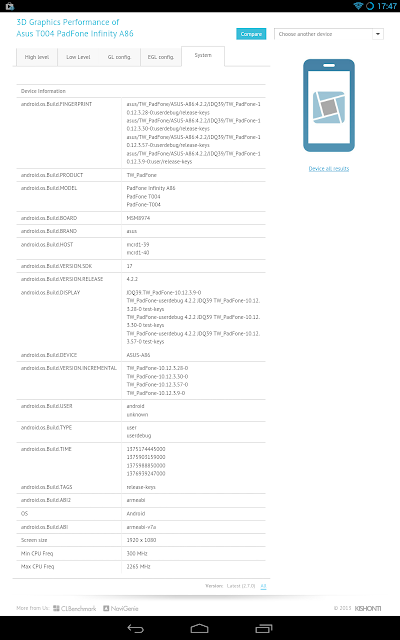
Many flagship smartphones released during the first half of 2013 were powered by Qualcomm's Snapdragon 600 processor, prior to the release of the much more powerful Snapdragon 800. Instead of waiting one year to release a new flagship to deploy the faster SoC, many OEMs seemed like they couldn't wait to release a Snapdragon 800-bearing flagship. Samsung promptly released an LTE-A capable Galaxy S4 variant with the Snapdragon 800, and Sony has released the 800-powered Xperia Z Ultra, and now ASUS is also apparently joining the Snapdragon 800 party. Recent leaks on popular graphics benchmark GFXBench's online database reveal a Snapdragon 800-bearing PadFone Infinity smartphone. 

The device is named "Asus T004 PadFone Infinity A86". The T004 and A86 designations must be device model numbers or something like that. The device runs on the MSM8974 chipset, which corresponds to a Snapdragon 800 model. The leaked device has a 1920 x 1080 resolution, like the current PadFone Infinity, and runs Android 4.2.2.

Just for a recap, the Snapdragon 800, Qualcomm's most powerful SoC, contains four Krait 400 cores clocked at up to roughly 2.3GHz, plus a groundbreaking Adreno 330 GPU and dual-channel DDR3L-1600 memory (12.8 GB/s max).


The benchmark scores for the leaked PadFone device are simply breathtaking. Don't think that the scores are bad just because they're behind the Snapdragon 800 Galaxy S4, as this S4 variant is in first place in GFXBench's database (Hell, it beats the Nvidia Shield). This new PadFone Infinity is also at the very top of the benchmark charts with almost identical scores to the Xperia Z Ultra. Considering that in the beginning of the year the fastest devices were achieving 12fps on the T-Rex HD test, it's impressive to see how Qualcomm is driving mobile performance forward (and you're hearing this from a Tegra fan), doubling the performance in just half a year. 23.1fps on the T-Rex test is a very impressive score. The device also rendered some impressive scores in the Egypt HD test, getting close to the vsync limit in the Onscreen test. Fill rate is also pretty impressive, beating the Nexus 10 and getting close to the iPad 4 (the PadFone Infinity needs just about half of what these devices need due to their higher resolutions). Triangle Throughput is also very good. Even though the PadFone Infinity (along with just about every other Android device) still pales compared to the iPad 4 in terms of Triangle Throughput, the Adreno 330 will almost definitely never be bottlenecked by that factor. 

Of course, all this information is to be taken with a grain of salt, as there is no way to confirm their validity. However, with the IFA event in Berlin just around the corner, it makes a lot of sense for ASUS to refresh their smartphone flagship at this time. I guess we'll have to wait until September 10 to find out whether this device is real.

HP SlateBook x2 Review: A Good Tablet Plagued by Too Many Design Flaws

HP hasn't had many shots at making tablets yet. Their previous release, the Slate 7 was rather disappointing, but I must admit I felt excited when they announced their 10-inch Tegra 4-powered, Full HD Android tablet/notebook hybrid. It was especially exciting for me to see that both the tablet and keyboard would sell for a reasonable $479.99 price tag. Unfortunately, though, the SlateBook x2 turned out to be good only in theory, because while the device looks great on paper, it turned out to be plagued by so many design flaws it ruined my expectations for the device, making it not worth the $480 price tag.


I actually quite like the industrial design HP used here. The back of the tablet is made of a nice-looking plastic, and is available in two shades of grey (* wink *), light and dark grey. A rather large Hewlett-Packard logo is etched on the center, and on the top-center of the back is the 1080p-capable rear camera. HP did a rather odd thing here: they opted to place the power button and volume rocker at the left and right edges of the back of the device. This makes the buttons considerably easier to reach when you're holding the tablet in landscape, but it still looks a bit awkward.

On the front, the 10-inch 1920 x 1200 display is surrounded by not too large nor too narrow bezels. I actually think that this is the ideal bezel size for a 10-incher. Above the display is the 720p-capable front-facing camera and the ambient light sensor. Below the display is a small, centered HP logo (why do OEMs usually insist on putting two logos on their devices?), and below it, on either edge of the device is a speaker grille. Overall, I like their design language, at least for the tablet only.

Every once in a while I review a device, and I see design flaws that are so obvious that I realize how little effort some OEMs make to produce a decent product. The SlateBook x2 is once such victim of its OEM's carelessness, because when you dock the tablet into the keyboard, the microSD card slot and the headphone jack become inaccessible, because the dock connector is in the same side of the tablet as these two ports. You can probably get past the microSD slot's positioning quite easily, but c'mon, I'd like to be able to plug in my headphones and have the keyboard docked at the same time. Additionally, the speaker grilles, also located on the bottom end of the tablet, also get hidden when the keyboard is docked. Thankfully, this doesn't affect the sound quality too much, but come on HP, it's common sense. However, the keyboard dock is otherwise well designed. It looks nicely crafted, and the multi-touch pad is slightly wider than what we usually see in 10-inch keyboard docks. Typing on it should feel more or less the same than it would on any other 10-inch hybrid (cramped, but still usable).

HP didn't offer any numbers on weight and thickness of the tablet only and, probably to emphasize that the dock is an essential part of the product, only gave us the numbers referring to the tablet plus the dock. With the dock on, the device weighs an OK 1.29 kilograms and is relatively thin, at 0.81". 

On paper, you'd think the device's display is pretty good. After all, the LED-Backlit 10.1 inch unit has a respectable resolution of 1920 x 1200 (224ppi). But the display's sharpness isn't the problem, it's the color accuracy that's way off. Basically, the SlateBook x2 can't reproduce anything close to white. When rendering web pages with white backgrounds, you'd see a distinct yellow tinge instead of white. And I'm not saying the display's white temperature is a bit warm, I'm saying it's a distinct yellow. The color inaccuracy basically ruins the display for most uses. 

Under the hood, the device is, again on paper, a very capable one. That's because the SlateBook x2 houses NVIDIA's state-of-the-art Tegra 4 SoC, accompanied by 2 GB of DDR3L-1600 RAM. If you don't know/remember, the Tegra 4 is a 28nm SoC consisting of a quad-core ARM Cortex-A15 CPU clocked at 1.9GHz (this tablet is limited to 1.8GHz though), plus a power saver Cortex-A15 companion core which is limited to 825 MHz and is designed to handle light tasks, increasing battery life. The powerful CPU is accompanied by an equaly powerful 72-core GeForce GPU and dual-channel DDR3L @ 1899 MHz. With such powerful specs, you'd expect the SlateBok x2 to be blazing fast, but if Android Jelly Bean and Project Butter taught me something, is that software is as important as the hardware for a device's speed, and the SlateBook x2 further proves that, because despite having a very capable processor, the tablet still feels slow at times. For example, apps take longer than usual to open. If it's not a software issue, I'd say that the problem is slow storage transfer rate (they were rather mediocre in benchmarks). Gaming performance is not as bad in the SlateBook x2, as it can produce very similar benchmark results to other Tegra 4 devices (the NVIDIA Shield is still ahead, though, probably because it has a cooling fan), hence gaming performance shouldn't be a problem, especially at 1080p (Tegra 4 can handle 2560 x 1600 resolutions well, so it can handle 1080p even better). 

The SlateBook x2 runs on stock Android 4.2.2 (the only customization is a couple of HP ultilities installed). The $480 price will get you the tablet, the keyboard, and 16 GB of storage (expandable through the microSD card slot). I think its nice that the $480 price tag is for the keyboard included. But still, the truth is that HP's tablet has potential; it has a crisp screen, a nice looking industrial design, just about the fastest SoC available and that useful keyboard dock, but it has so many design flaws that ruin the user experience of the device. The saddest part is that these flaws are very obvious and pretty easy to remedy, which shows that HP didn't care much about making the device good. Due to its flaws I strongly recommend other tablets at the same price point, even if they don't have a keyboard dock included, for example the Sony Xperia Tablet Z, the iPad 4 or the even cheaper Google Nexus 10. 

sábado, 24 de agosto de 2013

ASUS ROG G750JW Review: Excellent Specs and Beautiful Design at a Reasonable Price


Another WMC event, and another ASUS ROG gaming laptop to impress us. ASUS' latest G750 gaming laptops retain what the previous G-series laptops excelled at, and add an improved design, the latest Intel Haswell and NVIDIA GeForce GTX 700M hardware, and run the latest Windows 8. The G750JW is the laptop we have for review today, and it sells for a reasonable starting price of $1,249.


The G750-series laptops feature somewhat aggressive,intimidating design, which has been part of the Republic of Gamers brand's identity. Inspired on a stealth fighter and with a jet black paintjob, the G750s have "gaming" written all over them. The outside of the lid is very rubbery, but unfortunately it can be a fingerprint magnet at times. On the center is a large ASUS logo, and beneath it is the Republic of Gamers branding, which illuminates when the display is on (in a similar way to the MacBooks' illuminating Apple logo).


The back of the laptop houses two large air vents for the laptop's elaborate cooling system. This ensures that you don't hear the coolers as much (they're very silent anyways) and you won't have hot air blowing into your hands while using a mouse. 


The left side houses a Kensington Lock, two USB 3.0 ports, a DVD burner and a SD card slot (from left to right).


The right side contains the charging port, as well as VGA, Ethernet, HDMI and Thunderbolt port, as well as two more USB 3.0 ports and a 3.5mm microphone jack and headphone jack. 
With all these ports, you'll never be disappointed by the laptop's connectivity options. 


Open the laptop, and you have, fitted in a black-colored, brushed alumunium chassis, a backlit, chiclet-style keyboard, and beneath that there's a large touchpad with very tactile left and right buttons. The aluminium chassis is very pleasing to touch, and makes typing comfortable, and ensures the palm rests don't heat up at all, even during intense gaming.


The keyboard itself feels very solid, and typing on it is very easy. The large screen size also allows for a numeric keypad to be included. Also, the backlighting of the keyboard makes typing in the dark an easy task.


The G750's display is, to put it simply, beautiful. It has a LOT of screen size for a laptop, measuring 17.3 inches diagonally. The 1920 x 1080 Full HD LED Matte screen makes for crisp text and clear images, as well as very rich colors, and also reduces bothersome glare. However, some grain is visible when viewing text on a white background, but that's an easily forgettable issue. Especially when watching videos or playing games, the G750's display is astounding due to its deep colors, high contrast, high resolution, and large size. 

Well, this is a gaming laptop, so evidently the most interesting part of it is its performance. And ASUS does not disappoint. All of the G750 laptops are equipped with Intel's latest Haswell Core-i7 CPU and a high-end GeForce GTX 700M series GPU. In the case of the G750JW, we're looking at a Core i7-4700HQ CPU (4 cores/8 threads @ 2.4GHz, up to 3.4GHz with Turbo Boost) and a GeForce GTX 765M GPU.

The choice of the 765M is very interesting, because it almost exactly matches the Xbox One's GPU in terms of clock speed and core count. The 765M is based on the very efficient Kepler architecture, and contains 768 shader cores, 64 TMUs (Texture Mapping Units) and 16 ROPs (Render Output Units). The default clock speed is 797 MHz, but the thermal-based GPU Boost 2.0 can ramp it up to 901MHz. Basically, the GPU clock will be boosted to 901MHz when needed until it heats up to a certain thermal limit, and then the clock returns to 797MHz. Thanks to the G750JW's very good thermal design, though, I didn't once see the clock drop below 901MHz in my testing, and I can assure that the 901MHz clock can be kept for at least one hour of looped benchmarking, but it can probably go for way longer. This GPU has 2 GB of 128-bit wide GDDR5 memory @ 2GHz nominal clock (4GHz effective), resulting in peak memory bandwidth of 64 GB/s. At the default clock speed, the GPU can achieve 1.22 TFLOPS performance, and with the GPU Boost 2.0, the compute power goes up to 1.38 TFLOPS. Like I said, though, the GPU Boost can be kept for an indefinitely long time, so you'll be enjoying the 1.38 TFLOPS figure mostly.

These numbers stack up pretty well against the Xbox One's GPU. In comparison, it has the same core count (albeit with 16 less TMUs than the 765M, as in 64 vs 48 TMUs), with a clock speed (853 MHz) that gives the GPU 1.31 TFLOPS. So as long as the 901MHz clock can be kept constantly on the 765M, you'll even have a bit more compute than the Xbox One, and without the GPU Boost clock you'll still get pretty close to it. The only place where the 765M has a potential disadvantage is its limited memory bandwidth. Against the 256-bit wide DDR3-2133 memory of the Xbox One (68.2 GB/s), the difference is negligible, but taking into account the huge bandwidth optimizations the on-die 32MB eSRAM gives the Xbox One, the 765M is left behind by a big margin. Of course, you can easily overclock the 765M's memory to give up to 76.8 GB/s bandwidth (due to the GPU Boost 2.0 not being visible to the software, I couldn't overclock the GPU cores, just the memory).

The limited memory bandwidth is the 765M's biggest potential bottleneck, though in my testing I didn't see the memory controller hitting its limit without the GPU load being at 99% too, so the memory bandwidth seems to be on par with the compute power available. However, I highly recommend you overclock the memory. It can safely be overclocked to 2.4GHz, which gives 76.8 GB/s of bandwidth, and is quite a leap from 64 GB/s. I will run a few benchmarks and then update this post soon. 

So basically, the 765M is a very safe choice, because it means that, theoretically speaking, you'll be able to run any game as well as an Xbox One would, unless perhaps if it's too heavy on the memory bandwidth. I tested Resident Evil 6 and Assassin's Creed III on it, and, while Resident Evil 6 ran virtually flawlessly at 1080p, with max settings and the highest Anti-Aliasing option, Assassin's Creed III, at 1080p, would require me to lower Anti-Aliasing and Shadow quality, and would run pretty smoothly (but still, it could relatively smoothly, read: slightly non-smoothly, render large forests even with Environment quality set to max). So 1080p gaming is perfectly possible, but you may have to reduce a couple of settings to get mostly smooth framerates, and with a 765M, you'll at least have the comfort of knowing that you're on par with a current gaming console. 

Our review unit came only with a 5400 rpm 1TB hard drive, since it is the entry-level $1,249 G750JW, and the lack of an SSD hits the general speed of the computer significantly, particularly when booting the PC. Not that the hard drive is painfully slow, but it's still by far the weakest component of the whole setup. This unit also came with 8 GB of RAM, which is definitely enough for the most demanding games, but may not be enough in a few years. ASUS makes this easy to remedy, though, as the two hard drive slots and two of the four RAM slots are easily accessible through a lid at the back of the laptop, so you can just pop in an SSD or some extra RAM quite easily. If you have the money, I'd really recommend putting in the SSD, because with that addition, the computer will be simply blazing fast (not that it's not already like that for most uses). 


You can see how the lack of an SSD bogs down the laptop here. While CPU, RAM, and GPU benchmark scores all resonate relatively uniformly inside the 7.0-8.0 range, the hard drive is way off, with a score of only 5.9. However, this will only be a problem in situations that use a lot of I/O, so gaming performance will not be affected, it will make loading times longer. 

Well, so how good is the G750JW? for its price, excellent. I don't think there's an alternative in the market (except perhaps Toshiba's Qosmio X75, but that laptop compromises with a not-so-good design) that can offer so much quality and performance for that price. Basically, it's like the top-end G750JH, but with a watered-down GPU, no SSD and less RAM. Hence, I highly recommend the G750JW for anyone who is looking for a gaming laptop that performs very well, but can't afford the top-end beasts. And if you have the money, the higher-end G750JX/JH models are what I consider to be the best gaming laptops around.

quinta-feira, 15 de agosto de 2013

Possible New ASUS Transformer Pad (2013) Benchmarks leak

One of the biggest sources of device leaks come from benchmark databases, and GFXBench's online database has just spilled the beans on an upcoming ASUS device running NVIDIA Tegra 4.

The unknown device's name only registers as "ASUS Eee Pad (Tegra 4, retina)". This is very odd, because the Eee Pad brand has vanished for over a year, as it was replaced by the Transformer Pad title. Now, I don't think a revival of the Eee Pad name is likely, so I assume we're dealing with a new Transformer Pad iteration here.


The leaked results point to a Eee Pad device, running Android 4.2.2, running on a 1.9GHz Tegra 4 processor and with a 2560 x 1600 display. That falls in line with the official specs of the upcoming 2013 Transformer Pad Infinity. The software build numbers (WW_epad-10.14.0.39.3) are in accordance with ASUS' usual firmware build numbers, which gives these results more authenticity. 


The device's performance is pretty much in line with what the Tegra 4 has produced so far. Analyzing the very shader intensive T-Rex HD tests, You can see that, while the Tegra 4 can't quite outperform the iPad 4, it gets extremely close to it, to an extent that the difference in framerate is negligible (granted, the iPad 4 is 10 months old now, and it still has the lead). An impressive feat is that, on the Onscreen test, the Tegra 4 can keep itself very close to the iPad 4 despite the fact that it's pushing about 1 million pixels more. The performance hit for all these pixels should be much larger, so something about the Tegra 4's architecture helps it scale performance well as resolution increases.

The Egypt HD test looks a bit worse for the Tegra 4. At normalized resolution, it can push a respectable 50 fps, but it's still about 5 fps behing the iPad 4, and in this test, the higher resolution seems to penalize the GPU more, as the gap increases to a 13 fps difference between the two. It can still push 30 fps though, which proves the Tegra 4 is capable of playing most mobile games at native resolution while keeping a fluent framerate.

Fill test was always Apple's forte and at the same time NVIDIA's achilles' heel, and while fill rate isn't as horrendous as it was on the Tegra 3, thanks to Tegra 4's dual-channel (finally) DDR3 memory subsystem, it's still significantly behind the iPad 4, and even the Nexus 10. 1130 MTexels/s is a decent score, but falls begin the iPad 4's 2089 MTexels/s capability. This could be especially a problem at this extremely high resolution. While Tegra 4's memory bandwidth should be enough for most games, even with its resolution, a few games could suffer slight performance hits due to limited memory bandwidth, but I think that's only to occur later in the future. 

Triangle throughput isn't bad in the Tegra 4, as it can keep up with the Mali-T604 in the Nexus 10 and the Adreno 320, but, again, this is another speciality of PowerVR GPUs, as the iPad 4 and its PowerVR SGX 554MP4 trumps anything Android-based in terms of triangle throughput. But still, there shouldn't be any bottlenecks caused by triangle throughput in this device. 

I would take this information with a grain of salt, as there is no way of confirming the validity of these results. However, the fact that the results seem to fall in line with other Tegra 4 devices, and the specs reported are in accordance with ASUS' upcoming Transformer Pad Infinity tablet (more info here), and the firmware naming scheme seems pretty real, add up to make a big chance of this being a real device, probably the new Infinity. The 10-incher Android tablet is expected to launch in this quarter, so these results might indicate it will launch very soon.

segunda-feira, 12 de agosto de 2013

Sony Xperia Z Ultra Review: Ultra Large, Ultra Fast


No one can deny it. Sony has made huge strides in the smartphone department, going from being a minor smartphone vendor to one of the market's biggest players. Having successfully taken on the smartphone competition with the rugged Xperia Z, and also produced quite a good tablet with the Xperia Tablet Z, Sony is now extending the Z-series' reach to include phablets. Enter Xperia Z Ultra. The new flagship device touts an already proven design with a beautiful, enormous screen and industry leading performance.


The design is where Sony has become extremely successful this year, and it shows in the Xperia Z Ultra. To put it simply, the Ultra is SLIM. Measuring 6.5 mm, the phablet is thinner than just about every major smartphone available. It's quite heavy, weighing 212g, but when you think about its size you realize it's pretty light. Despite being so thin, and despite having such a classy design, Sony managed to make this device as rugged as it can get. The Ultra has IP58 certification, which basically means it's dust proof, and also waterproof, for up to 30 minutes under one meter of water (given that all the ports are covered), so, despite how fragile this device looks, it can take a lot of damage.

The back of the device, much like the Xperia Z and the Tablet Z, is beautiful. Very simplistic and very stylish, the back is covered by a layer of glass, which gives the device a slightly reflective effect. The phablet is available in black, white, and purple (?). The bottom of the back contains an Xperia logo, and on the center there's a Sony logo. On the top, there's a very good 8 MP camera, capable of 1080p video and HDR, but without an LED flash. The general cleanness of the back, together with the glass-induced reflectiveness, results in a very premium, expensive look for the Ultra. 

The front of the device is almost 100% display, which has become common in large screen devices. The left and right bezels are very slim, but unfortunately the top and bottom bezels could be slimmer. Granted, though, the top bezel needs space for the Sony logo, the proximity and ambient light sensor and the front-facing 2 MP camera, also capable of shooting 1080p video (a bit pointless really, in my opinion), and the bottom bezel is probably as large as the top one to induce symmetry in the design.

Honestly, I think that the Xperia Z Ultra is too close to tablet territory in terms of screen size. Measuring 6.4 inches diagonally, it begs for more comparison to the Nexus 7 than, say, the Galaxy S4 or Note II. Many people will probably like it, but personally, I think the display size isn't ideal for neither tablet-like nor smartphone-like use. 6.4 inches means it's probably too big to fit into your pocket (and the added weight also makes that more difficult) and it could be awkward to stick that to your face and talk on the phone, so I find it inadequate for use as a smartphone. So the only reason why you'd want that device, other advantages aside, is either if you think the Nexus 7 is too large (you probably don't, except perhaps if you have tiny hands) or if you want something almost Nexus 7-sized that can make calls (a question from the Galaxy Tab 7.0 time, when it was often discussed how weird it is to talk on the phone with such a big device). You might have other reasons, and if you feel the screen size is good, you can't possibly be disappointed by the Xperia Z Ultra.

Odd screen size aside, the display is gorgeous. Sony is introducing the new Triluminos display technology with X-Reality enhancement, which is the successor to the already proven Mobile BRAVIA Engine. Basically, X-Reality will boost the color saturation of images, video, games, etc. significantly, making everything pop out more. The 1920 x 1080 resolution results in a pixel density of 344ppi (lower than 5" 1080p smartphones' 441ppi, but unless you're using a microscope you won't notice the difference), ensuring razor-sharp text and clear images. Combine the enhanced colors of the display, thanks to X-Reality, with the very crisp pixel density, and you have a near-perfect display in your hands. 

Under the hood is where the Xperia Z Ultra impresses the most. That would be because the Ultra is one of the first products to launch with the brand new Snapdragon 800 SoC paired with 2 GB of RAM. For a recap, the Snapdragon 800 is a 28nm SoC consisting of four Krait 400 cores ticking at a monster 2.3GHz, plus a brand new Adreno 330 GPU, which, as benchmarks show, is by far better than any of the competition, even NVIDIA's recently launched Tegra 4. The Xperia Z Ultra can therefore handle, and I say literally, anything. UI performance will definitely be flawless, and it'll be a monstrous mobile gaming machine (it's faster than the NVIDIA Shield. Period). The Ultra's SoC will only disappoint you when OpenGL ES 4.0 becomes the norm in games, and would happen around 2018-2020. To put it simply, whether you want a device to do some simple web browsing, reading and watching videos, or if you're a hardcore mobile gamer, the Xperia Z Ultra won't disappoint you.

Other specs include Android 4.2 out of the box and a non-removable, beefy 3050 mAh battery, but ironically, Sony claims 16 hours of talk time and up to 7 hours of video playback, which is good, but not as good as the battery size might suggest. Well, I suppose that's the price for such a large display.

The device was already released, although it hasn't arrived in the US yet, but you can find it in a retailer or two for $799. This is, I think, the same price as the Galaxy S4 without a contract, so it's not unaffordable, and it works perfectly as a phone, touting 4G LTE connectivity. If you're not bothered by the screen size, you're basically getting a near-perfect device. It offers a beautiful, yet very durable design and spotless performance, and I definitely recommend the device if the screen size is OK for you.

Toshiba Excite Pro Review: A great hi-res tablet plagued by an unattractive design


Toshiba isn't a very big player in the tablet space, but, well, maybe it's trying to become one. They announced, earlier this year, three Android 10-inch tablets, each competing at different price points, the Excite Pure, Excite Pro and Excite Write, which sell for $299, $499 and $599, respectively. Whatever qualities these devices have, it still remains that Toshiba's industrial design is far from attractive, which, in the tablet market, is likely to single-handedly make this device be a failure.

The Excite Pro is the middle child in the Excite family. It offers some top-notch specs at an accordingly high price of $499 for the 32 GB version, which puts it in the same price range as the Nexus 10 with the same storage capacity, and is the same price as the entry-level 16 GB iPad 4.


Its main downfall is its design, like I said before. Statistically speaking, it's not a svelte tablet. It's 10.2 mm thick (thicker than the 9.4 mm iPad 4) and weighs a reasonable 635g (lighter than the 650g iPad 4, but still considerably heavier than many Android tablets out there).

The back is composed of two stereo speakers positioned on either side of the device, horizontally. These speakers are produced by harman-kardon, and can therefore reproduce some excellent sound. Then there's a Toshiba logo on the bottom left, and the top right houses a pretty good 8 MP camera with F/2.2 aperture lens, alongside an LED flash. The back is made of an industrial, rather unattractive gray plastic. The front houses some rather large bezels, and, above the very good 10.1" 2560 x 1600 display is the ambient light sensor and the front-facing 1.2 MP camera, and below the display is, on the left of the bezel, a Toshiba logo, and to the right, a harman/kardon logo. I find the two logos are too much of a visual interruption, and ruin the looks of the front of the device too. One logo is easy to overlook, but any more than that, and the front doesn't look nearly as clean as it should be. 

The display of the Excite Pro is at the top-notch configuration of the tablet market, as it features a large, 10.1" screen size and a whopping resolution of 2560 x 1600 pixels, which gives the display a very crisp 299ppi pixel density, which is on par with the Nexus 10, and higher than the iPad 4's 264ppi. The high resolution, combined with the display's IPS technology, ensures wide viewing angles, colorful, clear images and razor-sharp text. 

Of course, one does not simply pull off such a high resolution display without a lot of processing power under the hood. Never fear, though. The Excite Pro is perfectly equipped to handle even complex 3D games at its native resolution, thanks to its blazing NVIDIA Tegra 4 SoC. For those who don't know, the Tegra 4 has a Quad-core ARM Cortex-A15 processor running at up to 1.9GHz, with a low-power A15 companion core for handling light tasks and increasing battery life. The CPU is coupled with an equally fast 72-core GeForce GPU and 2 GB of DDR3L RAM.

WIth such a high-resolution display and what appears to be a potentially power hungry SoC, one would be concerned about the device's battery life. Well, as it is, the thick profile of the device gives it the one big advantage of being able to carry a larger battery, and while the 33 Wh "Prismatic" battery included isn't the biggest ever seen of a tablet (the iPad 4 has a 42.5 Wh battery and is still considerably thinner), Toshiba claims it can get you through 9.5 hours of video playback, which is quite good, considering how many pixels are being pushed there. 

The Excite Pro, from a spec point of view, is one of the absolute best tablets out there. It marries a pretty beefy battery with an excellent display, industry leading performance, but unfortunately the looks of the tablet simply spoil whatever other advantages it has. In the tablet market, it's definitely better to have a better looking, more svelte tablet but with slightly weaker internals. And at $499 for 32 GB, there shouldn't really be a compromise on either aspect. While some people might not care about the bad looks of the device, there are still other alternatives which for the same price, offer almost identical performance and have designs which aren't painful to look at.